JW Player
Segmentation Report Builder – 2017
This report builder was a custom data segmentation tool made for a small group of middle-advanced users. Our B2B customers with the largest teams and resources generally tapped into the data with an API or exported it. But there was a gap between those users, and the ones who only needed the most basic data provided on the analytics overview dashboard.
These in-between customers needed more, so we created a simple and usable UI for them to tap into their data. The Segmentation tool is key for understanding how video content is performing across different domains, media properties, and viewing platforms.
Components
Contextual help
Dimensions and metrics can be hard to understand. Very advanced users were probably not using our analytics tools. We wanted to provide context and help for users trying to understand some of their more complex data.
Advanced charts
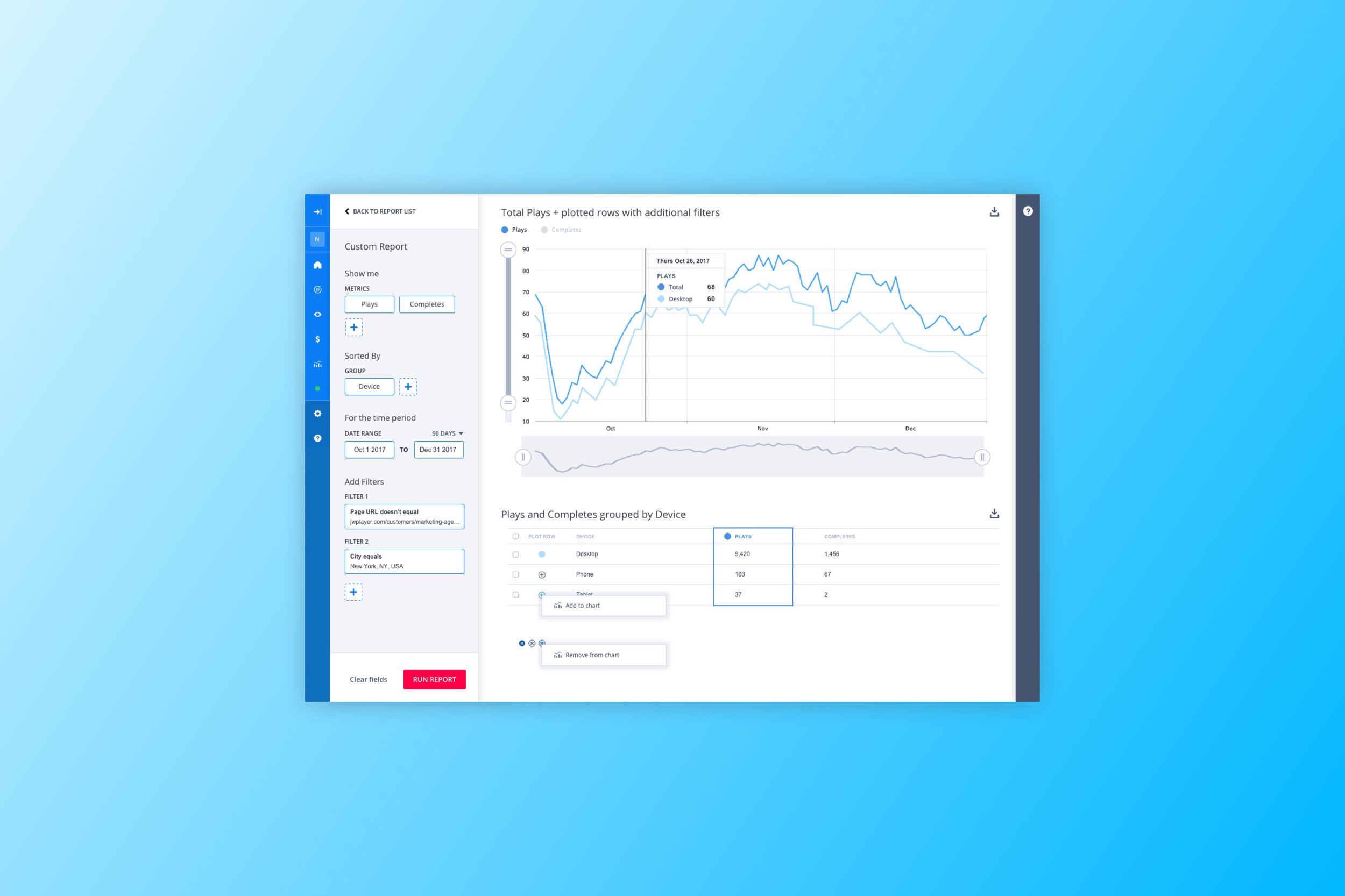
We added charts with range sliders to allow for easy visual zooming in and out of trends and time periods, instead of relying on a date picker and needing to run the report multiple times to capture the ideal time window.
Design System
We were refactoring the entire customer portal in sections, and this feature was being rebuilt on the new platform. As the design lead for the new design system, I took this opportunity to standardize our dropdown styles and rules, and create documentation for the different dimensions and metrics available in the new Segmentation tool.
Full View
Empty States
Report templates and a help panel are surfaced on the user’s first interaction with the Segmentation tool. On the left panel, the user selects a precooked report, or opts to build a custom report, and the right panel provides contextual help based on the contents of the report. The help panel remains open until the user closes it, and remains closed by default on return visits.
Zooming in on data
A report run with a wide date range on the left, zoomed in on the right.
Toggling metrics
A plays vs completes report on the left, with the table data sorted into groups of devices.
On the right, the user has toggled off the Plays metric, and within the Completes metric, plots the “Desktop” only segment on the chart, to compare against the total number of Completes.


